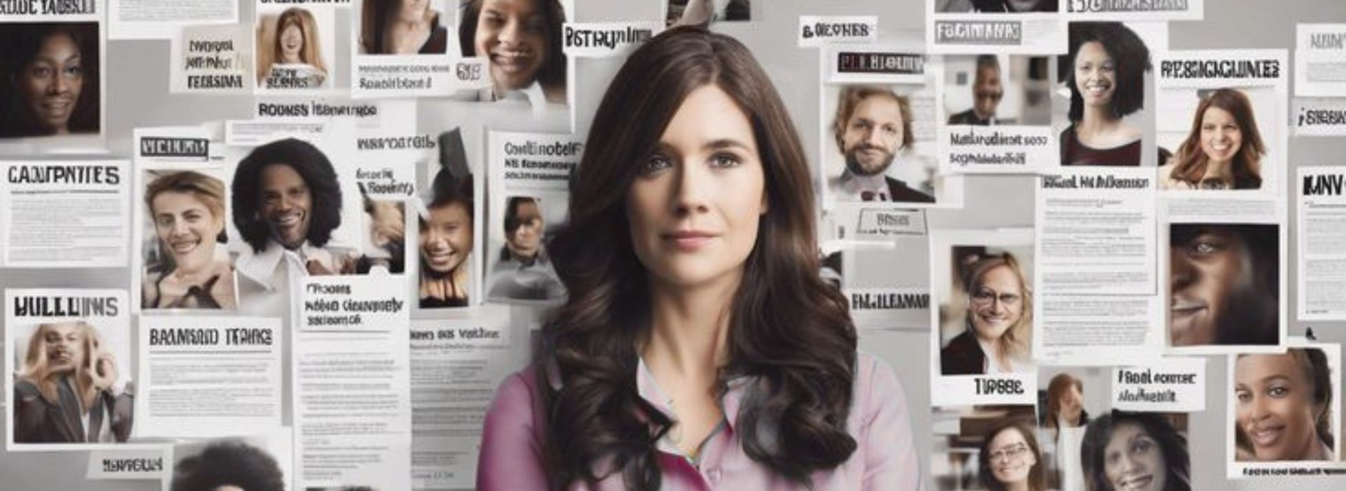
Your LinkedIn headshot is doing more work than most people realize.
Before someone reads your headline, checks your experience, or opens your featured section, they see your LinkedIn profile picture.
And in that one glance, people make quick decisions.
✅Do you look credible?
✅Do you look approachable?
✅Do you look memorable?
✅Do you look like someone worth following, hiring, or connecting with?
That is why your LinkedIn profile photo, LinkedIn headshot background, and overall LinkedIn profile picture style matter a lot more than people think.
Most professionals obsess over their headline and About section, but ignore the one thing that gets seen first: their face.
This blog breaks down the best LinkedIn headshot styles, so you can understand what works, what each style communicates, and how to choose the right LinkedIn profile picture for your personal brand.
If you want to build a stronger presence on LinkedIn, this is not a small detail. This is part of your positioning.
Why Your LinkedIn Headshot Matters for Personal Branding
A strong LinkedIn headshot does 5 things:
- It makes your profile look professional
- It increases recall
- It helps you stand out in comments and search results
- It signals your personality and brand style
- It makes your LinkedIn personal brand feel intentional
On LinkedIn, your profile photo appears everywhere.
It shows up in:
- comments
- messages
- connection requests
- search results
- post impressions
- profile visits
So when people talk about LinkedIn profile optimization, your LinkedIn profile picture is one of the first things that needs to be fixed.
A weak photo makes even a strong profile feel average.
A strong photo can make a profile feel sharp, clear, and premium.
15 LinkedIn Headshot Styles That Work
1. One Colour Background
Example: Filipa Canelas

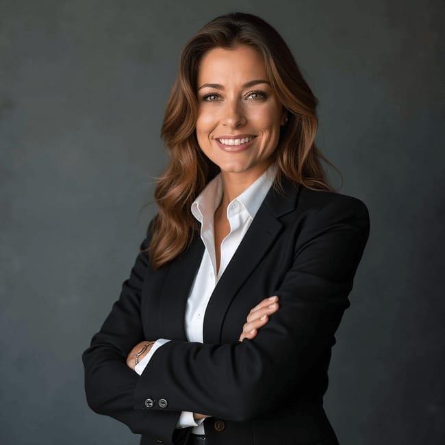
A one colour LinkedIn headshot background is one of the cleanest and safest options.
In Filipa Canelas’ example, the bright solid background makes the face pop instantly. This works well because it is simple, bold, and easy to recognize even in a tiny profile circle.
Why this style works:
- clean and distraction-free
- highly visible in comments
- strong for personal branding
- easy to match with brand colours
Best for:
- consultants
- marketers
- creators
- coaches
- founders
2. Linear Gradient
Example: Jay Clouse
A linear gradient LinkedIn headshot feels slightly more modern than a plain solid background. Jay Clouse’s example shows how a gradient can keep the image polished while adding more visual depth.
Why this style works:
- looks contemporary
- adds subtle design without clutter
- feels creative but still professional
- helps the profile photo stand out
Best for:
- content creators
- personal branding experts
- startup founders
- digital professionals
This is a strong choice if you want your LinkedIn profile photo to look designed, but not overdesigned.
3. Black and White (B&W)
Example: Jon Brosio

A black and white LinkedIn headshot can feel classy, serious, and confident when done well. Jon Brosio’s image shows how removing colour can make the expression and facial features stand out more.
Why this style works:
- feels premium and timeless
- reduces distractions
- makes the image look editorial
- works well for minimalist personal brands
Best for:
- strategists
- consultants
- authors
- leadership professionals
A black and white LinkedIn profile picture works especially well if your overall brand is thoughtful, sharp, and understated.
4. Simple Pattern
Example: Sadaf Sana Anwar

A LinkedIn headshot with a simple pattern background is a good middle ground between plain and playful. Sadaf Sana Anwar’s example shows how you can add personality without making the profile picture feel noisy.
Why this style works:
- adds visual character
- keeps the frame interesting
- helps your headshot feel distinct
- still looks professional when the pattern is subtle
Best for:
- educators
- speakers
- creators
- community builders
If your brand is warm and approachable, this type of LinkedIn profile picture background can work beautifully.
5. Natural Background (Blurred)
Example: Matt Gray

A natural blurred background LinkedIn headshot feels more organic and less studio-made. Matt Gray’s example keeps the photo human and real while still ensuring the background does not distract from the face.
Why this style works:
- feels authentic
- looks natural and relaxed
- still keeps focus on the subject
- works well for approachable brands
Best for:
- founders
- coaches
- creators
- wellness professionals
This is a strong option if you want your LinkedIn profile photo to feel human rather than heavily designed.
6. Two Linear Gradients
Example: Dakota Robertson

A two-gradient LinkedIn headshot background gives a more dynamic look. Dakota Robertson’s example uses colour in a way that feels bold and memorable.
Why this style works:
- visually striking
- helps the image stand out quickly
- feels modern and energetic
- adds more personality than a flat background
Best for:
- growth marketers
- creators
- brand strategists
- young founders
If your personal brand is loud, ambitious, and internet-native, this style can work well.
7. Solid Black
Example: Justin Welsh

A solid black LinkedIn background is simple, direct, and powerful. Justin Welsh’s example proves that black can make a profile photo feel premium without doing too much.
Why this style works:
- bold and high contrast
- premium look
- no distractions
- excellent for minimalist brands
Best for:
- founders
- B2B creators
- consultants
- executives
A solid black LinkedIn headshot is one of the safest bets for people who want strong authority.
8. Subject Outline + One Colour
Example: Bethany Jewkes

A subject outline LinkedIn headshot adds design while keeping the image clean. Bethany Jewkes’ example uses an outlined subject over a coloured background, which helps the face separate from the frame more clearly.
Why this style works:
- adds visual definition
- makes the profile picture more memorable
- works well in small sizes
- feels creative without losing clarity
Best for:
- creatives
- designers
- educators
- content creators
This is a great choice if you want your LinkedIn profile picture to feel a little more branded.
9. One Colour + Outline
Example: Luke Matthews

A one colour plus outline LinkedIn profile photo is a smart way to increase visibility. Luke Matthews’ example shows how the outline helps the subject stand out against the background.
Why this style works:
- improves clarity
- creates stronger separation
- looks polished
- makes the photo more distinct in feed view
Best for:
- consultants
- creators
- agency founders
- trainers
If your current photo blends into the background too much, adding an outline is a smart fix.
10. One Colour + Noise
Example: Nick Broekema

A one colour plus noise LinkedIn background adds a bit of texture. Nick Broekema’s example keeps the background simple but prevents it from looking too flat.
Why this style works:
- adds subtle depth
- feels a little more designed
- remains clean and focused
- makes the profile picture feel less generic
Best for:
- digital creators
- startup professionals
- marketers
- product people
This works well if you want a professional LinkedIn profile picture with slight texture and personality.
11. Two Colours
Example: Sarah Hart

A two-colour LinkedIn headshot background gives you more visual energy. Sarah Hart’s example shows how two colours can make the image feel bright, bold, and highly noticeable.
Why this style works:
- more eye-catching than plain backgrounds
- gives a creative feel
- can reflect brand colours
- strong for high-visibility personal brands
Best for:
- speakers
- creators
- coaches
- social-first professionals
For people building a bold LinkedIn personal brand, this can work really well.
12. B&W Subject + One Colour
Example: Jacob Pegs
A black and white subject with one colour background is a strong stylistic choice. Jacob Pegs’ example mixes contrast and simplicity very effectively.
Why this style works:
- high contrast
- visually memorable
- feels a little edgy
- keeps focus on the face
Best for:
- creators
- strategists
- designers
- brand-forward professionals
This style can help your LinkedIn profile picture stand out without getting messy.
13. B&W Subject + Backlit Glow
Example: Dan Koe
A black and white LinkedIn headshot with backlit glow feels dramatic and premium. Dan Koe’s example is one of the more stylized looks in the sheet, but it still keeps focus on the subject.
Why this style works:
- creates mood
- feels premium and cinematic
- grabs attention fast
- helps build a strong creator identity
Best for:
- creators
- authors
- speakers
- thought leaders
This is not for everyone, but if your brand is strong and philosophical, it can fit beautifully.
14. One Colour + Vignette + Outline
Example: Ketan Sethi

A LinkedIn profile picture with one colour, vignette, and outline creates strong subject emphasis. Ruben Hassid’s image pulls the eye straight to the face.
Why this style works:
- strong visual focus
- good separation
- memorable in a small frame
- designed but not too busy
Best for:
- creators
- consultants
- online educators
- growth professionals
If you want a more stylized LinkedIn headshot without crossing into over-editing, this is a smart route.
15. B&W Subject with Shadow One Colour + Outline
Example: Jane Knisica

This is a more layered style. Jane Knisica’s example uses a black and white subject, coloured shadow treatment, and outline to create something very distinctive.
Why this style works:
- highly memorable
- more artistic
- still clear in a small profile circle
- helps create strong visual identity
Best for:
- creators
- brand consultants
- social-first professionals
- people with a bold visual brand
This is a good example of how a LinkedIn headshot can feel branded, not just photographed.
16. Stylized Subject Illustration + One Colour
Example: Tommy Geoco
A stylized illustrated LinkedIn profile picture is very different from a standard photo. Tommy Geoco’s example feels unmistakable and highly recognizable.
Why this style works:
- instantly memorable
- unique visual identity
- strong for creator brands
- stands out heavily in comments and feeds
Best for:
- creators
- designers
- illustrators
- brand builders
This will not work for everyone. But if your brand is already creative and recognizable, it can work extremely well.
17. Subject Outline + Branded Design
Example: Lea Turner
A branded LinkedIn headshot design blends a personal photo with strong visual identity. Lea Turner’s example feels more expressive and more tied to a recognizable personal brand.
Why this style works:
- communicates brand personality fast
- makes the profile look designed
- helps with recall
- can align with content style and brand colours
Best for:
- creators
- coaches
- speakers
- personal branding professionals
If your whole online brand already has a visual language, this kind of LinkedIn profile picture design can make sense.
18. B&W Subject + Brand Emblem Logo
Example: Chris Do

A LinkedIn headshot with brand emblem or logo is one of the smartest options for people who have already built a strong recognizable brand. Chris Do’s example combines a black and white subject with a branded emblem behind him.
Why this style works:
- merges personal brand with visual brand
- feels established
- increases recognition
- supports authority positioning
Best for:
- founders
- educators
- creators
- agency owners
This works especially well when your logo already has recognition value.
Best LinkedIn Headshot Tips from the Reference Image
1. Soft light is best

If you are shooting outside, aim for the golden hours.
Good lighting can instantly upgrade your LinkedIn profile picture without fancy equipment.
2. Get someone to take the photo or use a tripod
Use a high-resolution image, ideally 400 x 400 pixels or better.
A blurry LinkedIn headshot quietly damages credibility.
3. Blur natural backgrounds

This helps keep the focus on you.
A good LinkedIn profile picture background should support the face, not compete with it.
4. Remove backgrounds with Canva or remove.bg
This is especially useful if you want a more branded or cleaner look.
A lot of the examples in the reference image clearly use edited or enhanced backgrounds.
5. Crop your photo properly
Take up around 60% of the frame.
That is solid advice. If your face is too small, the photo loses impact in LinkedIn’s circular format.
How to Choose the Best LinkedIn Headshot Style for Your Brand
Not every style fits every profession.
Here’s a simpler way to choose your LinkedIn profile picture style:
Choose a clean one-colour or black background if you are:
- a consultant
- a founder
- a doctor
- a lawyer
- a finance professional
- an executive
Choose a gradient, outline, or stylized design if you are:

- a creator
- a marketer
- a speaker
- a coach
- a personal branding professional
- a social-first founder
Choose a natural blurred background if you want to look:
- approachable
- human
- warm
- real
- less studio-made
The best LinkedIn headshot is not the fanciest one.
It is the one that fits your positioning.
Your LinkedIn headshot is not just a photo.
It is part of your positioning.
It is part of your credibility.
It is part of your recall.
A strong LinkedIn profile picture can make your brand feel clearer, sharper, and more premium before people read a single word.
So if you are working on your LinkedIn personal brand, do not treat your headshot like an afterthought.
Treat it like a strategic asset.
At Branding Over Coffee, we help professionals build stronger visibility through LinkedIn personal branding, LinkedIn profile optimization, and clear positioning.
If you want your profile to actually look like the brand you are trying to build, book a discovery call with us.